

FOLKS ACADEMY
Problem: Looking into the forums of our web apps, we noticed that several users were unaware of how the DeFi market is working, or how they can lower their investments risks as much as possible.
Solution: A free online video course platform covering multiple trading aspects, from the fundamentals of blockchain to advanced topics of DeFi.
Link: academy.folks.finance
My part in the creation of Folks Academy was instrumental in shaping a seamless learning experience. We kept an user-first approach across the entire project, as the end goal was to have our userbase understand all the needed aspects of DeFi. This has been done by conducting thorough research into user needs and preferences, and by crafting the interface to ensure intuitive navigation and accessibility for learners of all levels. Through categorization into Blockchain and Folks Finance Tutorials, users can easily access content tailored to their interests. Plus, the incorporation of quizzes not only tests users' knowledge but also incentivizes their educational journey.
Research
Competitive Analysis: To begin with, we reviewed platforms such as Binance Academy and Coinbase Learn. Both prioritize a wide range of content and put accessibility as a paramount. Community engagement is present through forums and social integrations, while they also use some gamification techniques to stimulate ongoing learning. These findings informed our approach for Folks Academy, helping us offer engaging and quality blockchain education.
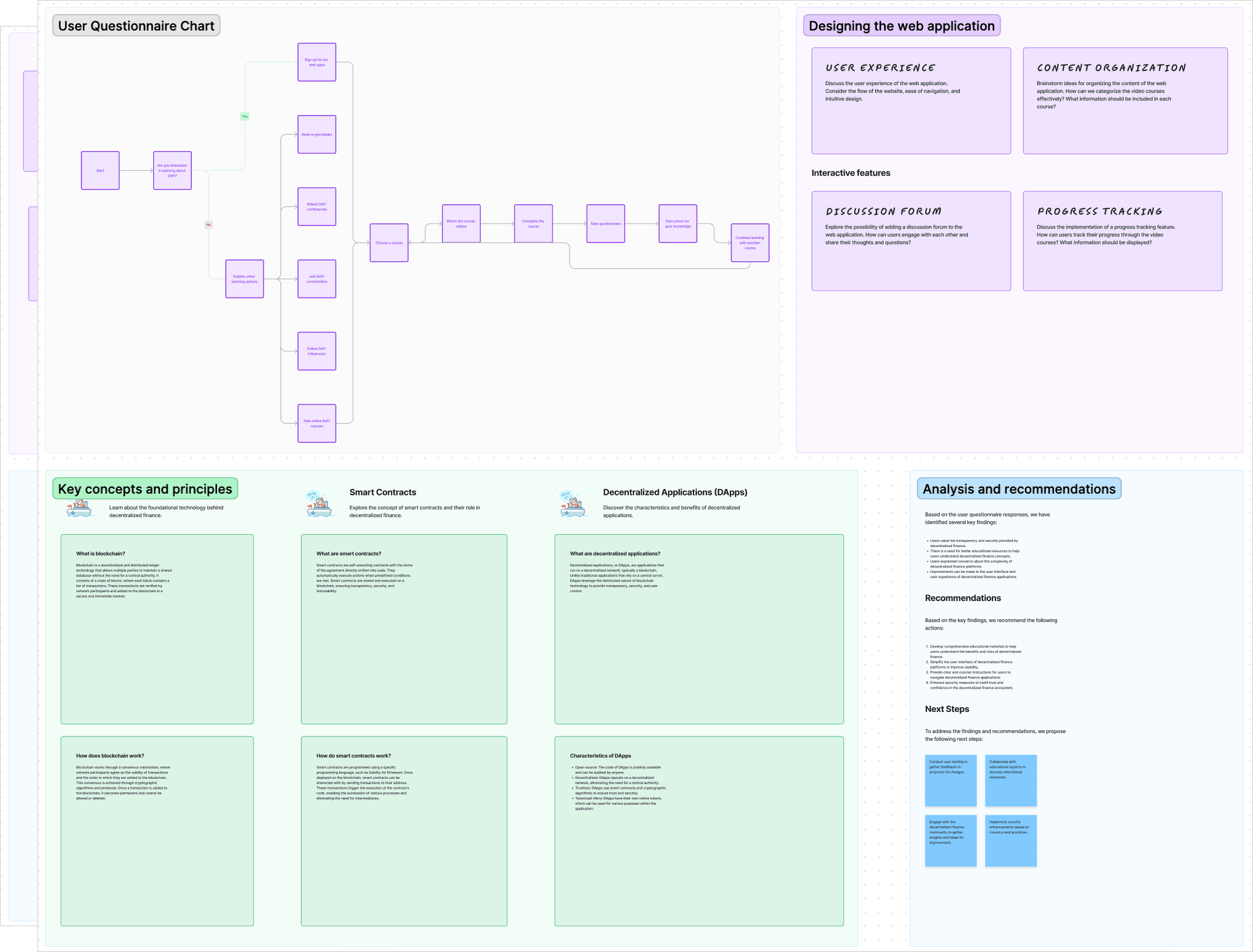
User Research: We conducted thorough research through users who were interested in trading crypto assets, but weren't sure where to start. We wanted to understand what were their biggest drawbacks and unclarities regarding DeFi platforms. We discovered that most of them didn't really know what are the fundamental technologies that empower DeFi transactions, or what basic trading operations are actually supposed to offer.
Homepage Design
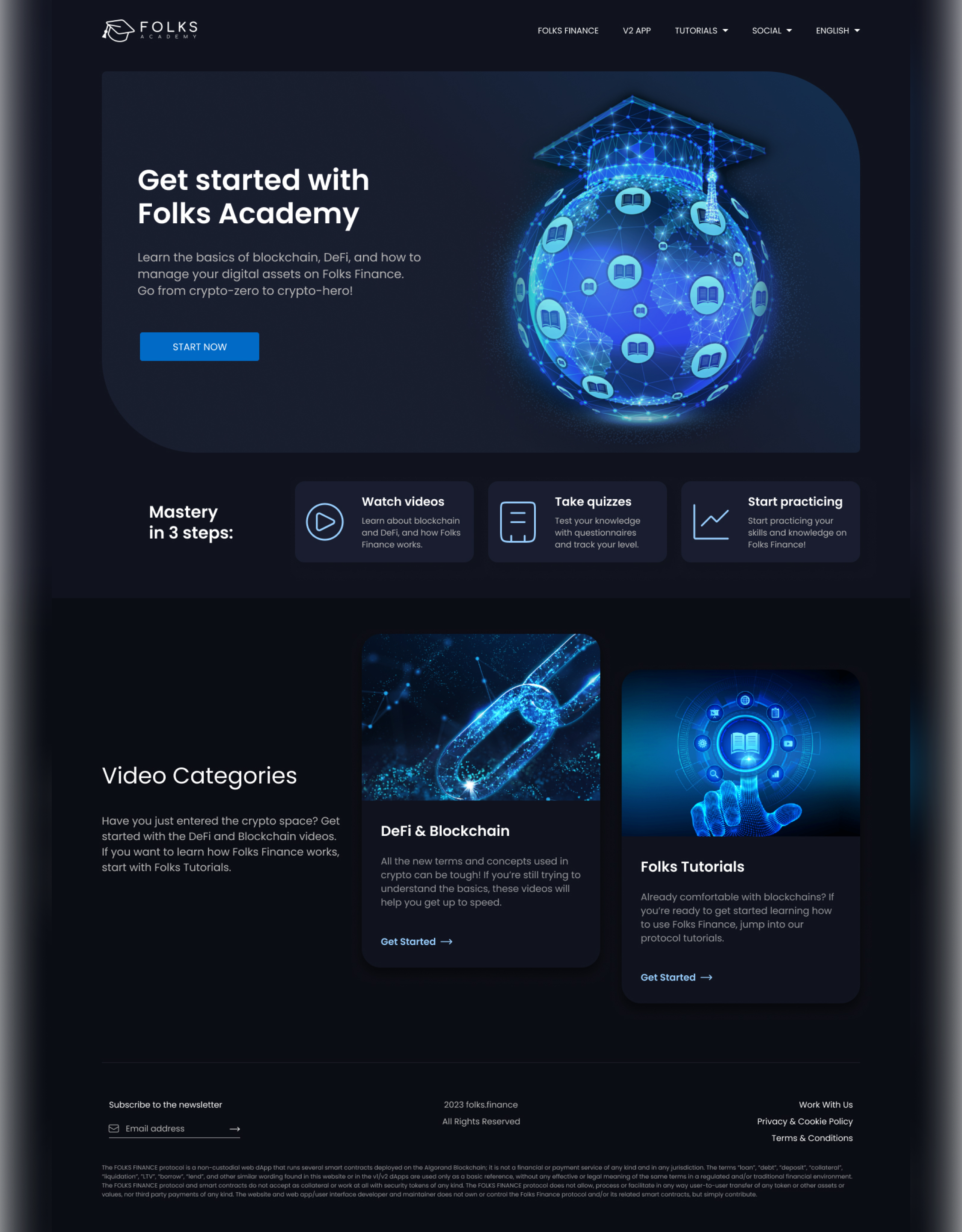
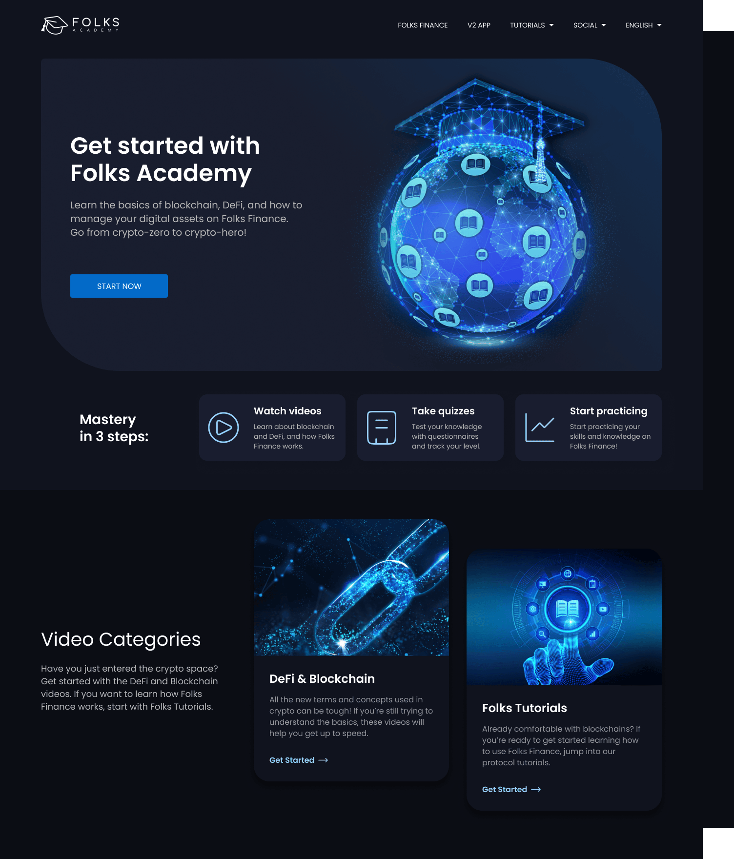
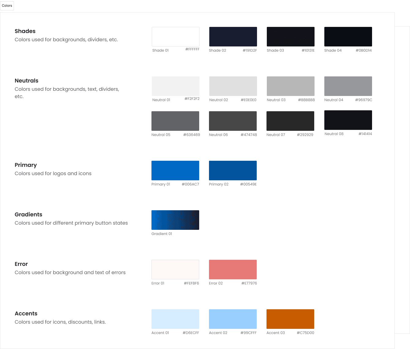
While designing Folks Academy, my focus was on maintaining simplicity and ease of use, as our userbase would be represented by beginners in the blockchain space. By maintaining a similar color palette to Folks Finance, I ensured a seamless transition for navigating between the educational platform and our decentralized application.
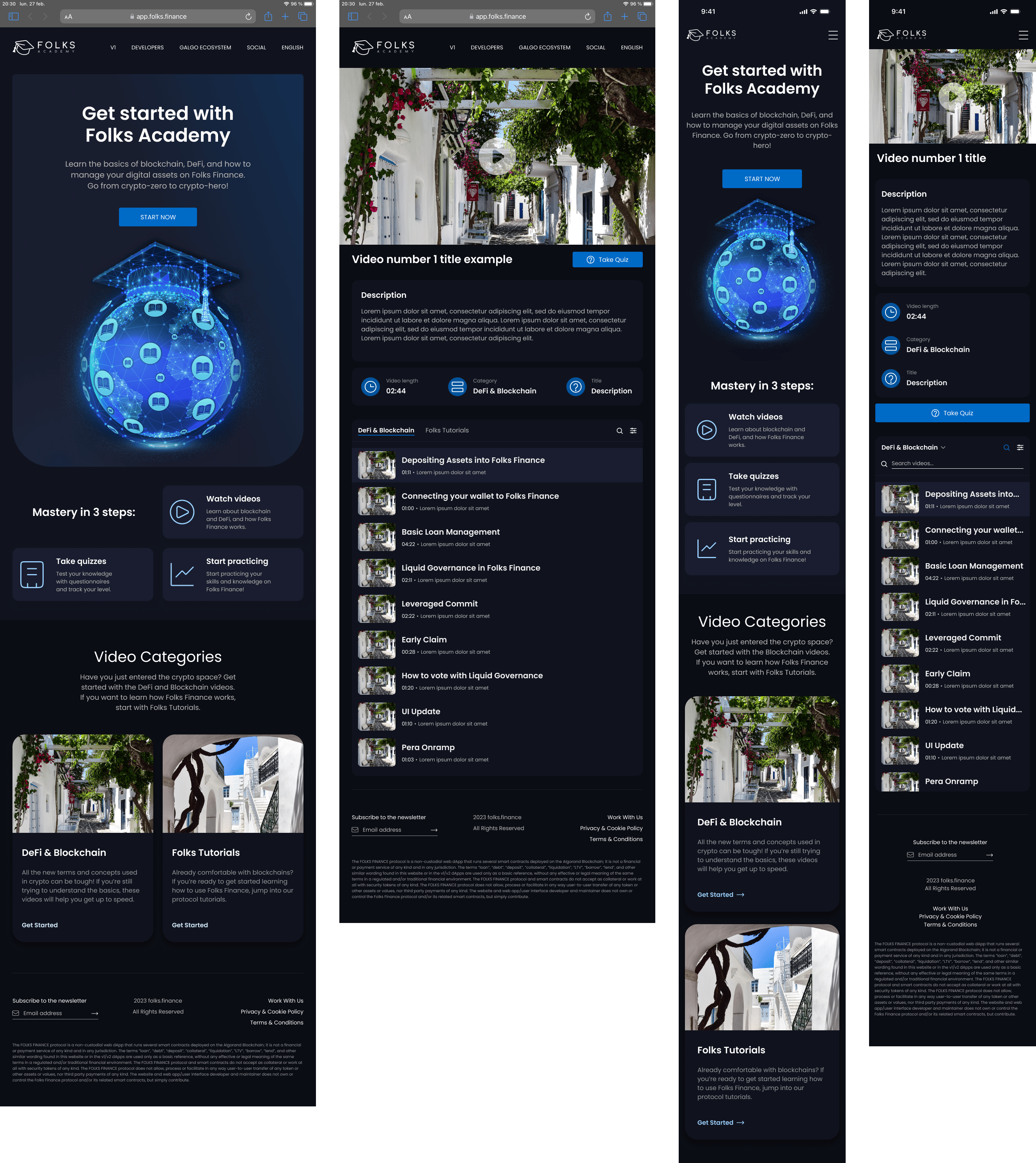
The page begins with a prominent, concise banner to immediately orient users to the purpose of the website. Below, I decided to incorporate a short roadmap, providing new users with a safe path to trade crypto, while subtly making them aware of our dApp. Also, the addition of a video categories section serves to streamline content discovery, with brief descriptions to amplify comprehension.
Throughout the design process, I kept the UX principle of limiting section elements to no more than seven, to ensure ease of navigation and rapid finding of the app's core features. Considering scenarios where users may feel overwhelmed by information overload, this approach promotes clarity and intuitiveness, to help for a more user-friendly learning environment.
Tutorial Pages UI
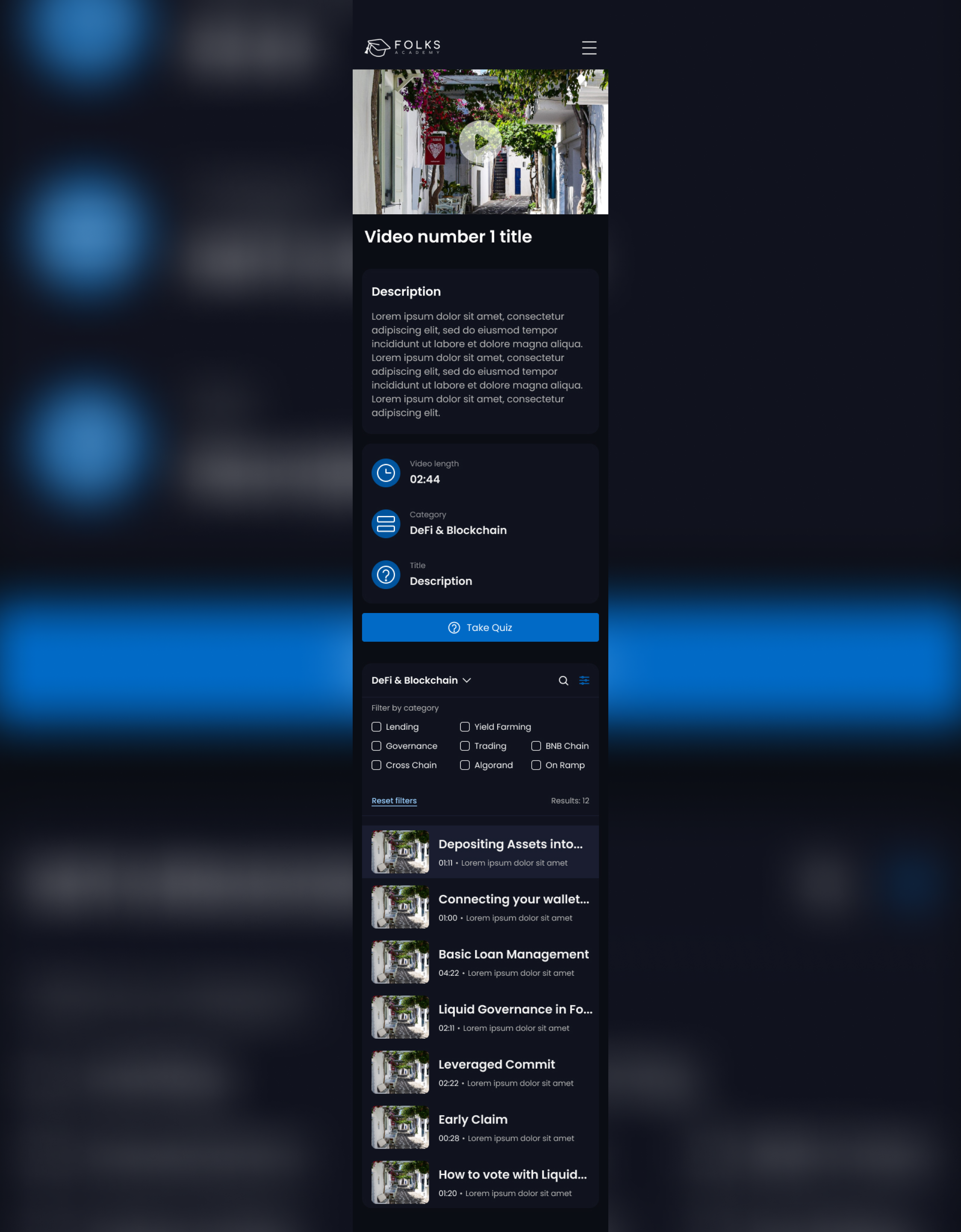
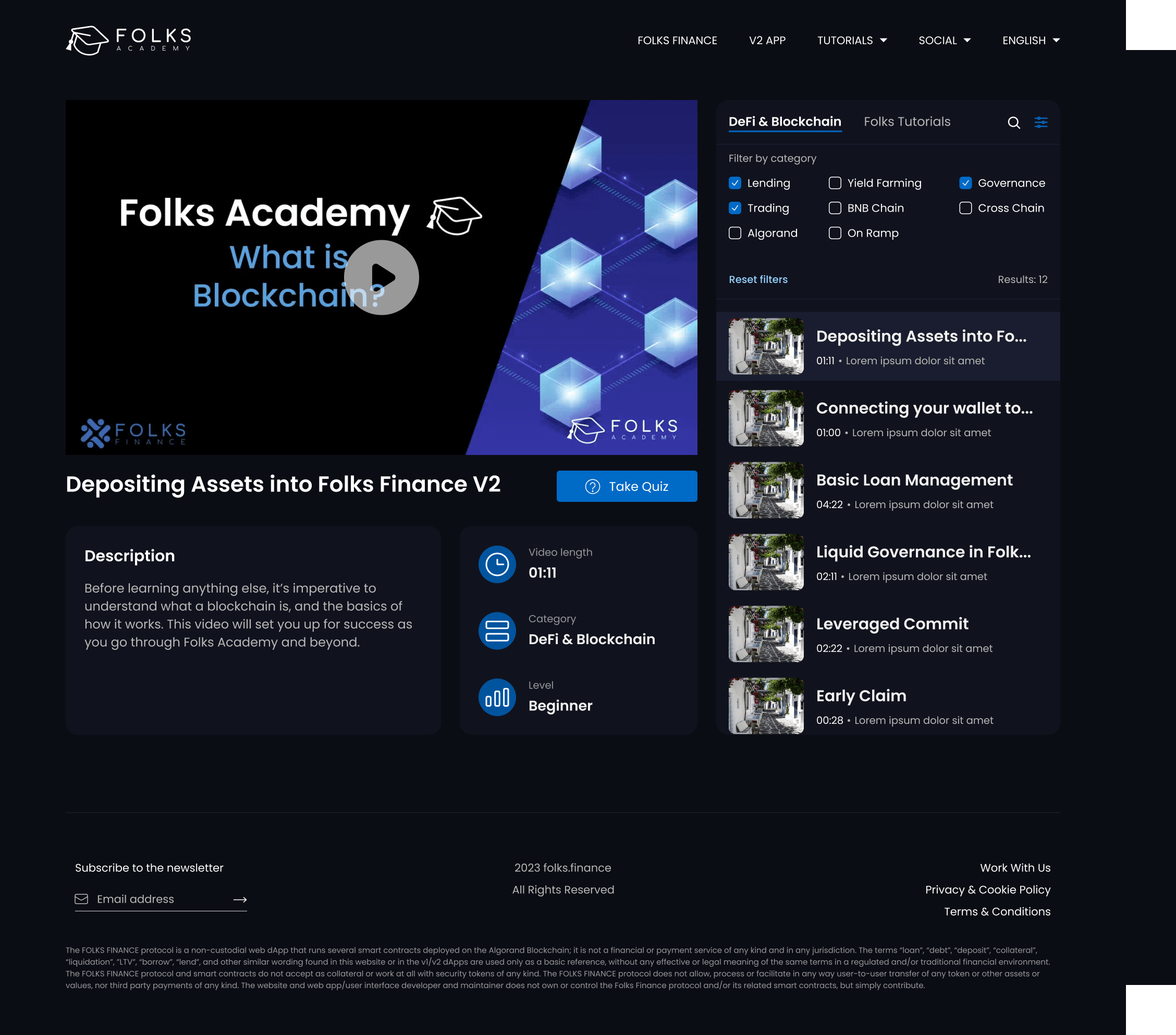
Our video tutorials have been planned to cover all users' weak points discovered in the research phase. As the users may vary in their familiarity with blockchain concepts, I put accessibility first in presenting the video content. Apart from essential video info, a "Take quiz" feature has been added, optionally for those who'd like to reinforce their learning and test their understanding of the content presented. This decision was informed by the desire to offer an in-detail learning experience that goes beyond passive viewing.
The playlist section further enhances content discoverability. The search and filter buttons enables users to refine their search based on specific topics of interest, addressing the challenge of navigating a large volume of educational content that my team wanted to publish. Overall, this UI embodies our commitment to empowering users with accessible and engaging learning resources in the large area of blockchain education.
Responsive Design
Having accesibility as my main priority, I created a seamless experience for users regardless of their preferred device. Through continous optimization, I put togheter a layout that adapts fluidly to different screen sizes or orientations, yet keeps our company's branding values. This involved working with flexible grids, scalable images, and breakpoints placed to maintain usability across all devices. I also prioritized intuitive navigation patterns to enhance the mobile experience further.
Design Handoff & Launch
I wanted to ensure a smooth transition from design concepts to implementation, and this is where my understanding of coding methodologies came in really handy, as it helped me put togheter a really detailed design specs package. This included colors, typograhy, assets used, plus technical specs and some code snippets for more complex components, where developers weren't sure how those should behave on certain viewport widths. I remained actively involved throughtout code implementation, addressing all questions and helping with the frontend QA, to make sure the final web app and my Figma prototype are pixel-perfect in comparison.
The launch of Folks Academy was a real success, and the user-centric approach has also paid off, as the current version's design is mostly the same as at launch. This is because we did not encounter any major problems in the user journeys while digging through analytics, and at the same time we noticed faster operations plus an increase in our TVL.
